
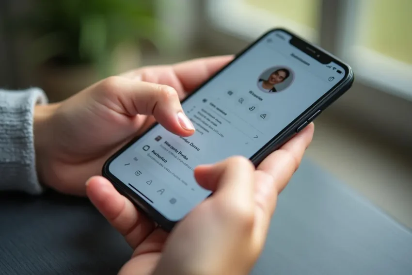
Creating user-friendly account profile screens is essential for enhancing user engagement and satisfaction in mobile applications. When users can easily and intuitively manage their profiles, they are more likely to interact with your app regularly. A seamless design approach can boost your retention rates while reducing friction that leads to user frustration. To see a wide variety of inspiring profile page UI examples, designers often look at curated galleries to inform their choices and spark new ideas.
An effective account profile screen streamlines the management of personal information, preferences, and settings. It also helps users feel ownership and control over their experience. Understanding the elements that shape a great profile page, from navigation to feedback mechanisms, will help you build a product that is not only functional but also delightful to use.
Understanding User Needs
Every effective account profile screen starts with understanding your users through research like surveys, interviews, and usability studies to identify valued features. Some prioritize quick access to personal details or security, while others want customization and connectivity. Aligning design to these needs improves usability and trust.
It’s also important to consider users’ emotional reactions. Features like personalized avatars or backgrounds boost emotional investment. Feeling seen and understood encourages loyalty. Experienced designers enhance traditional research with empathy and journey mapping to understand user stories and pain points better. This helps anticipate accessibility and inclusivity issues, creating a more universal experience.
Simplifying Navigation
Effective mobile navigation keeps options clear, visible, and limited to about five to reduce confusion and errors, as per Nielsen Norman Group. Avoid hidden menus to prevent abandonment. Use tabs, drawers, or bottom sheets to organize features, with microinteractions like animations for feedback. Test on real devices to maintain accessibility and touch-friendliness across screen types and orientations.
Maintaining Consistency
Consistent design language throughout the app makes the user experience more cohesive. Color schemes, button shapes, and typographic choices should match the overall brand identity and follow established mobile platform guidelines. This alignment creates a familiar feel, helping new users feel comfortable and reducing the learning curve for returning users.
Consistency isn’t just visual; it also applies to interaction patterns, terminology, and messaging. Ensuring that error messages, toggle switches, and flows for editing information all behave predictably across the app aids comprehension and trust. Users expect, for example, that saving changes in one part of the profile will work in the same way elsewhere. Meticulous documentation and reusable design systems can help teams maintain this uniformity even as new features are introduced or teams grow.
Designing for Touch
Given that mobile users will interact with the app primarily via touch, ensuring all interactive elements are comfortably tappable is essential. Apple recommends a minimum size of 44×44 pixels for tap targets, and Google recommends slightly larger 48×48-pixel targets. Generous spacing between buttons or links not only prevents accidental taps but also contributes to a cleaner, more modern visual design.
Additionally, it’s important to factor in accessibility for users with larger fingers or those with mobility challenges. Incorporating gestures, such as swipes to navigate between sub-sections or long-press actions to reveal editing tools, can enhance the experience for power users. However, always provide visible cues and alternatives for these gesture-based actions. Touch feedback, such as color ripples or slight enlargements on tap, provides sensory confirmation and can help users feel more in control of their actions.
Providing Clear Feedback
Users rely on immediate cues to understand that their actions have been registered. Incorporating visual feedback, such as a changed button color or a smooth animation, reassures users that their input was successful. Haptic feedback (short vibrations) can further reinforce interactions, creating a multisensory and responsive experience that elevates overall satisfaction.
Clear feedback is also critical in processes that require confirmation, such as changing a password, updating an email address, or uploading a new profile photo. Confirmatory dialog boxes, toast notifications, and summary views of recent profile activity make it easy for users to review and verify changes. In situations where errors may occur, such as invalid password input or connectivity issues, constructive, friendly feedback helps users recover gracefully and encourages further engagement with the app.
Leveraging Familiar Design Patterns
Reusing familiar icons and UI elements, such as a settings gear or a camera for profile photo changes, allows users to quickly and confidently navigate the profile screen. Established design patterns minimize the time users need to learn new workflows and increase efficiency. This is particularly important on mobile, where real estate is limited, and users expect to accomplish their goals quickly.
Building on established design conventions can also streamline your design and development processes. When users recognize and understand common interface elements, onboarding time is reduced, and overall user confidence increases. It’s important, however, to always test assumptions with user groups. Sometimes, small tweaks to established patterns, such as adding informative tooltips to icons or grouping related preferences, can further optimize flow and discovery while keeping the interface familiar and approachable.
Conducting Usability Testing
Consistently testing your account profile screens with real users uncovers pain points or confusion before the app goes live. This should be an iterative process, with each round of feedback shaping refinements and enhancements. Effective usability testing includes not just direct observation, but also collecting analytics on task completion rates, taps, and time spent, as recommended by usability experts at Nielsen Norman Group. The insights gathered help ensure your design decisions are grounded in actual user behavior and needs.
Remote usability testing can broaden your reach and offer insights from broader demographic segments, which is particularly valuable given that mobile users span different accessibility needs, cultures, and levels of tech-savviness. Incorporating follow-up interviews and surveys after testing sessions can yield qualitative insights to complement quantitative metrics. Documenting recurring pain points and user suggestions fosters a design culture of continuous improvement, ensuring your profile experience can evolve as expectations and technologies shift over time.
Conclusion
Creating mobile profile screens requires ongoing research, best practices, and user feedback. Prioritizing user needs, streamlining navigation, ensuring consistency, designing for touch, and offering instant feedback create a standout experience. Regular usability testing keeps the design aligned with user expectations, making it both practical and enjoyable. Good profile design boosts retention, satisfaction, and app differentiation. Focusing on these principles improves usability now and builds a flexible, future-proof product that adapts as needs evolve. Continuous design, accessibility, and feedback reinforce a trusted, beloved app experience.